GUEST POST: The (Usual) Pattern Emerges
Tim Oren breaks down the session thus far using data analytics.
(Editor’s note: This post is part of an ongoing series in which Tim Oren breaks down factional divides in the Idaho Legislature based on who votes with whom. This is entirely empirical, without relying on any subjective scorecards. Bookmark the Gem State Chronicle to see all of Tim’s posts in this series, which are generally posted Sunday evenings or Monday mornings.)
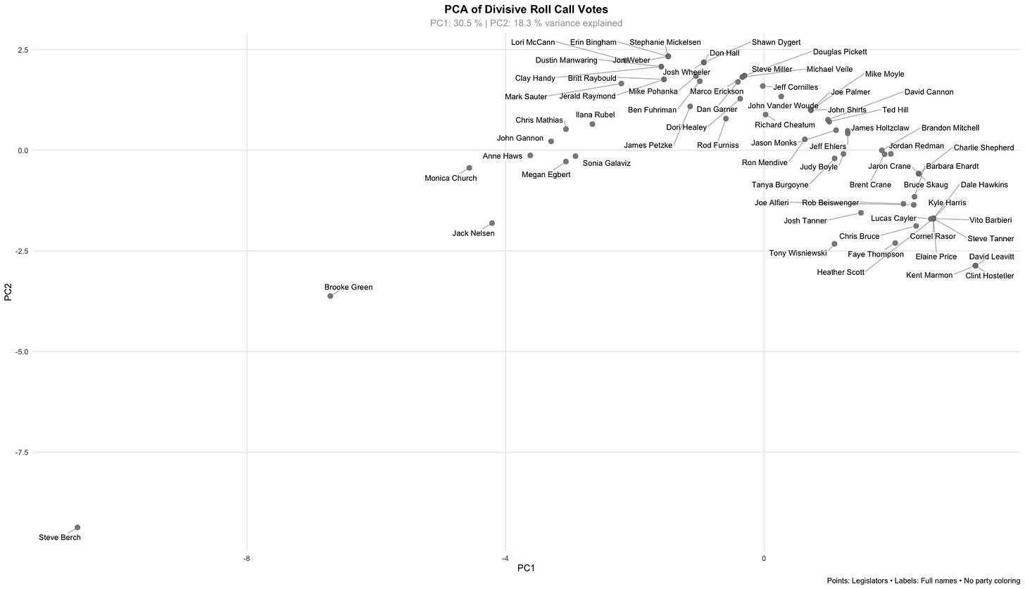
The Idaho House now has 21 divided votes in the record book, and that’s enough to begin – as promised – tracking the emerging political map of the session. (With only 5 divided votes, the Senate isn’t there yet.) Here’s the first chart of the year:
The ideological spread has emerged, with the Gang o’ Eight and friends on one end, and Steve Berch way over on the other, as per usual. There’s not enough data yet for the usual clusters to be visible. Most of the D’s are still adjacent to the IACI/RINO ‘Main Street’ gang (or you can read that the other way around). One member of the latter, Jack Nelsen, is voting right in the middle of the Democrat pack. Clean up on aisle 26!?
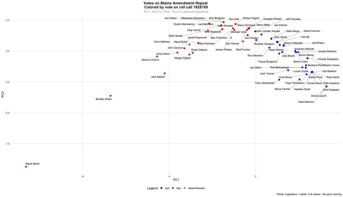
I’ll also be showing the more interesting votes of each week, displayed on the current map. Here’s the (failed) vote to propose an Idaho constitutional amendment removing the so-called ‘Blaine Amendment’ language:
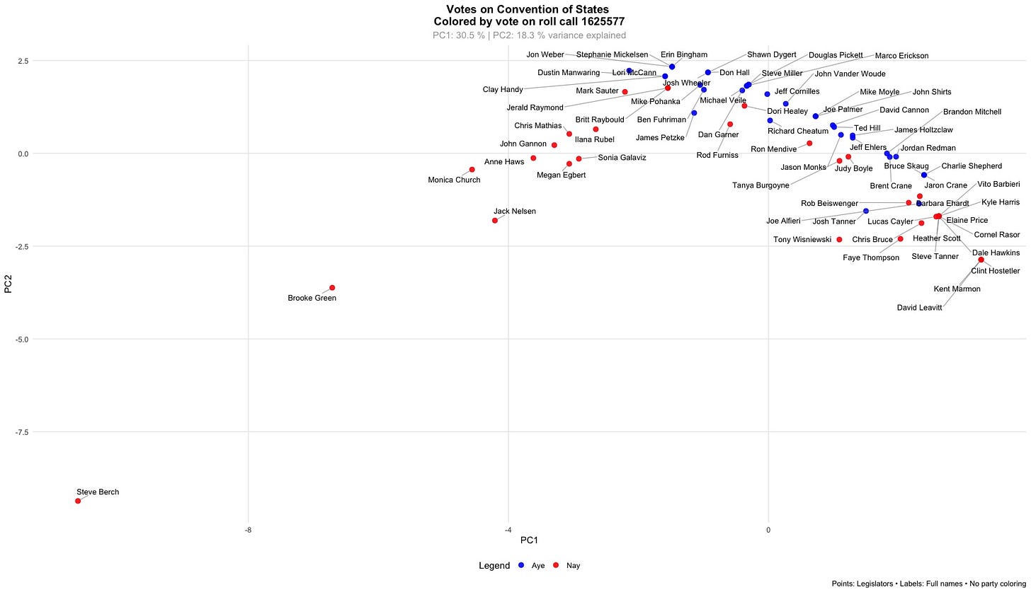
This vote follows the pattern predicted by the map almost perfectly. On the other hand, we have the narrowly successful vote to back a Constitutional Convention of the States to pursue a balanced budget amendment:
This is an unusual pattern for Idaho, one of the few cases of a ‘horseshoe’ alliance of the ends of the spectrum, the right worried that such a convention might exceed its charter and trample on natural rights, and the left presumably concerned that the convention would actually enact its charter.
The most impactful vote was probably that on conforming Idaho taxation to the changes in Trump’s OBBB, as it has an immediate $155 million effect on state general funds. However, it was a straight party line vote, so little to see here. With that exception, few of the votes to date have significant budget impact. That will change when spending bills begin to emerge from JFAC. In previous years, voting blocs on spending measures have closely aligned with those that appeared in voting on policy related matters. Will that rule hold? Stay tuned…
Tim Oren retired to Idaho after a 30 year career in Silicon Valley. Here he gardens, home-brews, teaches kids to shoot, and has applied his well-aged statistics degree to subjects such as educational funding and results, Idaho legislative race targeting, and now legislators’ voting patterns. He is a contributor to the Idaho Freedom Foundation and a number of Idaho candidates.


There are a couple of misunderstandings here leading to confusion about the map's interpretation. First, the 2025 legislative map was generated from raw floor vote information that I received via IFF, NOT from IFF’s scoring of those votes and bills. (The current 2026 maps are being generated from raw vote information retrieved from the Legiscan site.)
Second, the IFF Indexes were added as overlaid arrows on the 2025 map to help in interpretation only. The arrows point in the direction of increasing IFF score, which goes with voting for less spending and fewer government intrusions on liberty.
You can check out a later article (https://gemstatechronicle.com/2025/12/oren-scoring-the-scorecards-and-the-organizations-behind-them/) where I more carefully interpret various scorecards in light of the observable voting blocs. From this it’s clear that the Democrat corner of the map is in fact voting for both big spending and more state power.
It’s a limit of the statistical technique I’m using that it doesn’t provide axes that have a single neat label. It does, however, have two merits that persuade me to use it. First, it is optimal in the mathematical sense - it does the best job possible of explaining the observed voting pattern. Second, it does not oblige me to provide ideological labels to the bills (an alternate technique called factors analysis), as it’s the whole thesis of this project that you can learn more about the legislators by who they vote alongside, than by any labels they or outside scorekeepers - including myself - apply to the matter.
Thanks,
As one who used to write such things, recommend Tim always make at least a passing reference to the meaning of the axes and that the data result from IFF scoring.
But I'm still troubled by the interpretation of the axes from the previous post. Take the lower left cluster. The other three clusters are fine, but according to the freedom/spending interpretations, the lower-left group are statist maximalists who support the smallest amount of spending of any cluster.
That doesn't make much sense. According to the 2025 House chart, the most pro-freedom/small government cluster supports more spending than the far-left statists. ???
I suspect the problem is that when a spending bill comes up, no matter how much it spends, it's not enough for the statists. So they vote nay. The data don't distinguish between a nay vote because a bill spends too much or because it doesn't spend enough.
If so, correcting this would require a careful tweak to the underlying data by IFF and a more complicated analysis on Tim's part, which I'm sure he'd handle easily.
To be clear — love your posts.
JD